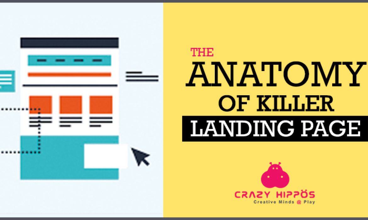
THE ANATOMY OF A KILLER LANDING PAGE
A Landing page is extremely important for any marketing campaign. A Landing page is a website page which is one of the most powerful tools specifically designed to convert visitors into leads. A good, persuasive landing page must grab the attention of your visitors and convince them to stay. Let’s take a quick look on how to craft an effective, high-converting killer landing page
The 7 major elements of a landing page
- ● A catchy and concise headline (Main Headline)
- ● A supportive subheading you can’t ignore
- ● An eye candy image ( preferably a image which depicts or shows what happens when the customer uses the product or service offered by you)
- ● A well-designed lead generation form to get in contact with your potential customers
- ● Clear action oriented call to action button
- ● A summary i.e, break down the benefits of your product/service into bullet points
- ● Social Proof i.e, Customer Testimonials
- ● Trust Logos

Powerful headline
Before creating a landing page, decide on a “clear and concise” concept . Stick to one main idea, and keep the copy’s short. The copy should be simple with impeccable grammar and should not be complicated. The headline and subheadline are the first things which a visitor notices in a landing page. Hence it should be able to spark an interest so that people continue reading it. The secondary headline should follow the same content which the main heading coveys. Otherwise, people may get confused about your offerings and lose trust. Be specific and do not clog the page with unnecessarily long copy’s which deviates from the main purpose of the landing page.
Engaging Visuals
A good landing page should contain visually attention grabbing images to drive the attention. Images are the first thing a visitor notices, hence it should give a good impression about your brand even before they read your copy. Avoid stock images because personalised images work better and can greatly increase the conversion rate. The page should have an “hero” image which should clearly communicate the product or service at a glance.
Simple Lead Generation Form
The lead generation form is one of the most vital part of a landing page. It can bring a difference between conversion and a bounce. The lead capture form should be optimised, asking only for information that you really need; name, company, phone number/ email ID. The placement of the form, also plays a crucial road in the success of your landing page. Place the form above the fold as it can fetch maximum number of eyeballs. This will help you in getting more qualified leads. The simpler you make it for visitors to contact you, it’s more likely they will take action.
Clear call-to action
A Clear and unmistakable CTA is very important to convey the value of your offer. It shouldn’t be drab and confusing and should be strong enough to convert the visitor to a customer. Make sure, you have only one call-to-action button. Too many of them will merely confuse people and you end up losing their trust. The CTA should be attractive and stand out. The easier it is to see, the better the chances of people clicking it.
Give an Explanation
It is important to communicate what the product/service offers crystal clear. Address the pain points, because humans are wired to avoid pain. Hence, when you make them think about it, they will subconsciously want to seek relief from the pain and you win a customer. Also, present your explanation in a way, it is easy for the visitors to read, preferably as bullet points. Highlight the advantages of your product.
Social proof & Trust symbols
So your landing page looks great. Your copy is persuasive. It is good to go . But still people may have their doubts and may not trust you. They may not know if they want theservice or product 100%. The best way to convince people is to show some social proof and what others are saying about the product, i.e.. Testimonials. This will help to instill trust and prove your boost brand’s credibility.
Do you need help to design or redesign your website and landing page?
Let us, Crazy Hippos, take a look and perform a quick audit of your site. We’ll give you our honest opinion on what your sites got going for it and where it could use some improvement. If it’s got nothing good going on, we’ll put it to you gently and then show you how great your website could truly be.


